DIY Rollers

Hello all,

                I am sorry it has been so long since my last post. I have been manic busy, painting murals, designing window treatments and helping clients.                                              Not all of us can afford custom made items (trust me I know that feeling). Cost is not the only reason to buy an “off the shelf” roller blind, timing can also be the reason. if you need something quick, you are going to have to DIY it.                                                                 If one or both of these reasons are pertinent to you then this is the post you need to read.

How To 1

Follow the instructions in the packet.

How To 2

Follow the below instructions for a closer it.

I have found when I have delved into the off shelf roller blind world that they advise to take off a HUGE amount when fitting in a recess.  A roller blind gaps, there is nothing you can do about this, however, we don’t want to make it worse by taking too much off, do we.

Instructions

Before you cut ANYTHING, measure your window and decide on your blind size. Inside recess or outside. Please see my other posts on measuring for help in this area.

IMG_3213

Measure The Brackets. 

Take this size off your blind sizeThis gives you your tube size.

IMG_3212

Take the blind apart. Slide the fabric off the tube and pull the weight out of the bottom. The brackets should already be separate.

To get your Fabric size and base weight size=  take off 1/4″ to 1/2″ overall. This is your Fabric Size. 

Before cutting mark everything out using a pencil and tape measure.

Use a good sharp strong hacksaw to cut down the base weight and tube. 

Be aware that blackout blinds tend to have metal tubes as they are heavier. Secure the pole so it doesn’t slip and take your time cutting. Turning the tube is sometimes easier and reduces chance of distorting the tube.

IMG_3214

Mark out how much you need to cut off you fabric then join the dots up the length of the fabric to give you a good line to follow. Try to do on the back.

IMG_3211

Cut using a good pair of SHARP scissors / sheers. 

IMG_3210

Be Careful where the weight goes as it is thicker.

If your blind is plain you can cut the fabric off one side. if there is a pattern you need to divide how much you have to cut off  and cut BOTH SIDES!

Patterned Roller Blind

Sadly off the shelf blinds do not always have a pattern that is centralised, this is why the following in necessary.

  • Pull out your tape measure to the size you need to cut the fabric to.
  • Centralise on the patterned blind.
  • Mark out both sides all the way down the blind.
  • Join the dots down the blind on both sides.
  • CUT.

It is not complicated but it can by fiddly. Just take your time, measure twice and cut once!

Good luck, thank you for reading and I will try not to leave it so long next time.Yours Faithfully

Elsie de Wolfe


What Curtain Fabric To Choose

16427213_1181795025260903_1906443613162295143_nHello everyone.

This is probably the most common question I have been asked by clients over the last 20+ years. Obviously there are several factors that effect your selection. If you are someone who prefers to look for your own fabric or just simply want an idea of what is out there, then this post is for you.

1.   COLOUR

Colour, the first question. What colour?

There are several ways to tackle this. You can match up with existing item/s in the room. You can choose either a complimentary or a contrasting colour. You can select a colour based on the type of room using colour theory. 

Yellow = A thinking colour, great for offices and places of activity.

Green = A relaxing colour, it is a calming shade. This is why you see it in doctors and dentist waiting rooms and on surgeons gowns. 

Red = A strong, warm colour not fantastic in huge quantities in a room you wish to relax in, can have a tendency to make people feel uncomfortable.

Blue = A cold colour, not advisable to use in north facing rooms or dark rooms, as it can make you feel colder than the room actually is.  

There are so many other parts to colour theory, that involve many factors, one of which is balance. This is largely related to the “Golden Section”. In basic terms the balance of 3, or 3 to 1 ratio. If, however you want to get technical = \varphi ={\frac {1+{\sqrt {5}}}{2}}=1.6180339887\ldots .

Simply put                                                                                                                                        For example if you are painting your walls and you want to use 2 colours, never paint 2 in one colour and 2 in another. It will never look right. I recommend you paint 1 in one colour and 3 in another. Or paint the alcoves in one colour and the rest in another, or paint the fire place one colour and the other walls another and so on. Selection of fabric can control this especially if the window takes up a big space.

Some people like the curtain / blind to blend with the wall, others like them to stand off / contrast with the wall. Some companies specialise is certain colour combinations. This factor is a personal design choice or style.

 Pattern

This is the big one. There is a plethora of choice out there, so what I am about to say only skims the surface. Some companies focus one a particular style and or pattern. Most companies have a mix of patterns across their portfolio.

Here are some of the basics.

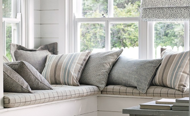
Stripes = Great on blinds and windows you want to make look taller. The wider / bigger the blind / cutain the wider the stripe needs to be, please don’t put a pin stripe on a patio window, the chances are it will send your eyes funny.

clews wc

www.facebook.com/whitewolfeint Harlequin fabric blind on an Evans Rail

Checks= Checks work on blinds and curtains, please be aware though that if the pattern runs out on the fabric, it always stands out more on a check.

7d446129-1c26-4968-a0b2-51dacbbb4ba4

www.facebook.com/whitewolfeint

Florals = These also go in most places, it is a style choice though. Modern florals and traditional ones are available. Closed pattern or open with lots of gaps. It is up to you what you can live with.vvsyqlphsjeahxfo.JPG_640x480_q85
IMG_1206


Designs by Kelly White at www.facebook.com/whitewolfeint 

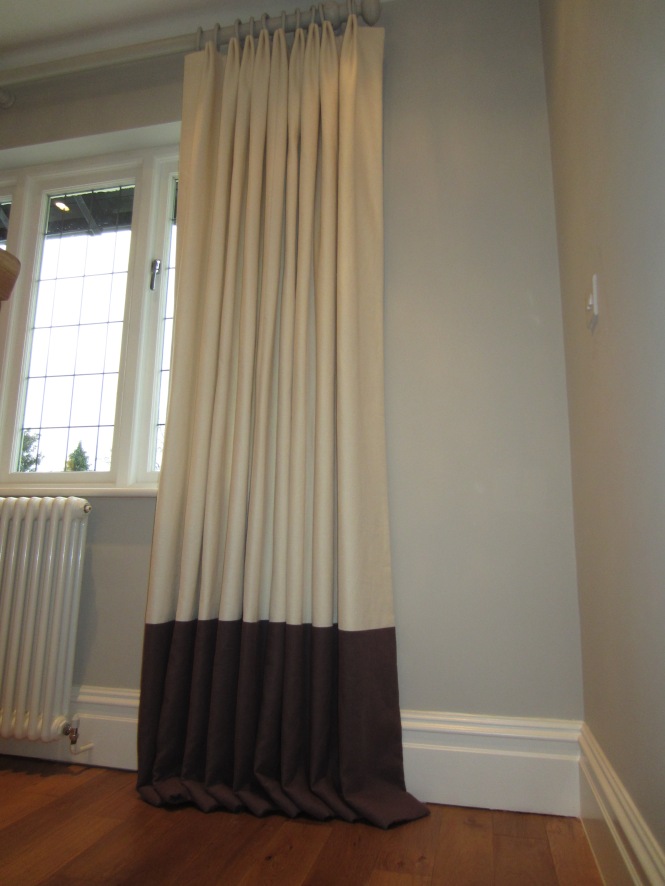
Plain= This works pretty much anywhere. You can make them more interesting by using contrast leading edges, borders and trims. A designer can go over choices with you.


Designs by Kelly White at www.facebook.com/whitewolfeint

Add In Fabrics= So you already have a pattern in a room?  What to put with what?

Stripe= Never use more than one type of stripe please, it very rarely works. However if you have a floral settee you could use a stripe on the window and cushions.

Check= Same rule applies as above. Checks are great as they go with anything. There are so many out their, modern and traditional. They are a great add in fabric.

Floral= Mixing florals can be tough but there are collections out there that do it for you, this can be very handy. You can find large and small florals in one collection in the same colour way.

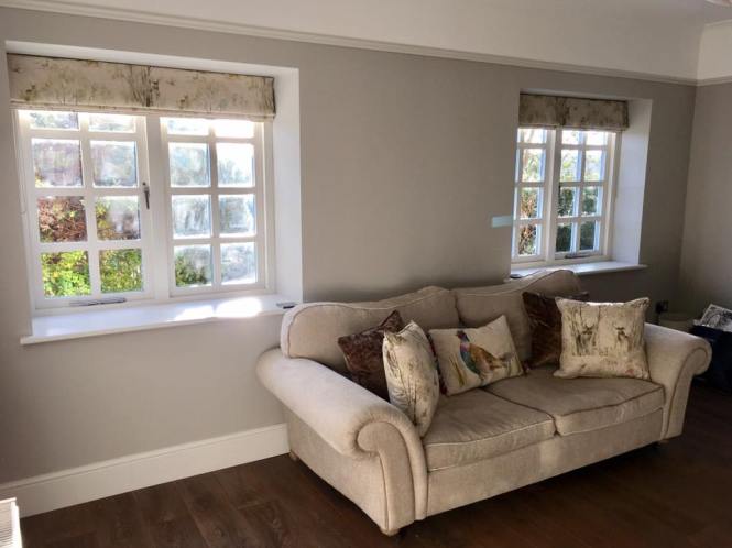
Traditional  / Modern = This all boils down to a clients personal preference, existing furniture and type of house. You do not have to have a fussy fabric for a traditional design or a completely plain one for a contemporary design.


Designs by Kelly White at  www.facebook.com/whitewolfeint

Company

Some companies specialise is a style, pattern, colour combination or even price range. It can be difficult to find the fabric you love only to discover it is out of your range or you feel it is more than you want to spend. These following companies are the tip of the iceberg and what I would class as the most well known of the companies.

 Lilaea-thumb

Harlequin fabrics ( www.harlequin.uk.com )= This company do a wide selection of patterns but largely focus on contemporary design. Florals, stripes, checks, you name it, they do it and they do it well. Middle to upper price range.

kelso-04

Romo Fabrics ( www.romo.com ) = This company do a mix also, however they are the ones I tend to go for if I need a stripe or check. They also have a great range of contemporary linen florals that drape really well. Middle upper price.


Sanderson ( www.sanderson-uk.com )= They have some contemporary designs but their strength lies in their traditional William Morris prints and weaves. These are beautiful, they are very good at re colouring them to make the colour pallet more relevant to today, as well as having traditional tones. Middle upper price.


Prestigious Clarke and Clarke ( http://www.prestigious.co.uk  & http://www.clarke-clarke.com/ )= These are companies that focus on good price points with crowd pleasing designs. They have a nice mix of patterns but stick largely to a more affordable price range.

Bali_M002

Fibre Naturelle (http://www.fibrenaturelle.com/ )  = This company I would go to for rustic weaves.

moon_header

Moon (www.moons.co.uk )= Brilliant for wool checks.

voyage-couture-2-enchanted-forest-fabric

Voyage (http://www.voyagedecoration.com/ ) = Weaves, embroidery a bit of affordable bling. They also have some great country prints. Middle upper costs.

Evolution

James Hare ( http://james-hare.com/ )= Silk


Designers Guild ( www.designersguild.com )= Unusual and vibrant colours and strong patterns. Upper price range.

7-Noukku-Wallpapers-Carousel

Scion Fabrics ( www.scion.uk.com )= Modern, fun almost Scandinavian in style affordable and good quality.

Drape / Fit For Purpose

This area I would recommend you get professional help with. It takes a certain level of experience to understand from a small piece of fabric how it will hang / drape. And if the type of cloth fit for purpose, for the room it is in. There is an earlier blog that goes some way to assist you in this area by listing the properties of some of the most well known fibre types. Only your designer / seamstress can guide you, however,  to how a particular fabric will work for you, the window treatment and how it will hang.

Fabric fit for purpose

Upholstery fabric has a martindale test. The Martindale is a unit for quantifying the abrasion resistance of textiles, especially when used for upholstery.

Soft padding
[Martindale]
Hard padding
[Martindale]
Private use 10,000 15,000
Office use 25,000 35,000
For public transportation 30,000 40,000

This is the official info. I personally would not touch an upholstery fabric less that 20/25000 rubs for domestic. 40+ for contract. The fire certificate is also different for domestic than contract. make sure you get a certificate. Contract is a higher rating and needs to be what is called crib 5.

I would not advise a Backcoated fabric treated for upholstery to be used on blinds or curtains as it has a tendency to be quite stiff, this can ruin the way the fabric hangs. The fabric can struggle to lay flat on a blind and skirts out on a curtain. The treatment also makes it tough to sew. Some people have chosen to use it but in the knowledge of the possible aesthetic results.

Often fabrics have on the back of the sample or book what their use is. There will be a picture of a curtain or settee for example.

There are also different fabrics for using in the gardenYou can also get indoor and outdoor foam.

IMG_3040

Designed by Kelly White at www.facebook.com/whitewolfeint

                                             I hope you have found this blog helpful / informative. If you have any questions with regards to this or any other post, even if it is just what the fabric is that I have used, please do not hesitate to contact me on this site or on www.facebook.com/whitewolfeint .

Thank you for reading.                                                                                                              Best regards

Elsie Wolfe                                                                                                                                   (Kelly White)

Box Bay Blinds

Hello all, 

                 Elsie here, here we are onto the next phase of blinds in bay windows. I hope the last post was helpful and works as a basis to add this next post to?

Box Bays

Measuring the recess is as before. With box bays however the positioning of blinds is very different.

If there are mullions or each window is separate the blinds will then function in their own recess and pretty much any blind can be used.

If however the windows are only separated by the window frame I have found that Romans or shutters are best for close fitting and minimal gaps.

Positioning of Romans in a box bay I find the following to be best……..

unnamed-8

Plan view of possible box bay configurations.

I find putting the back blinds in first is best.

Where you have two blinds butting up to each other in the same direction across the back. I always allow 1/8″ clearance between the two OA. This gives a nice close fit without them touching. 

unnamed-11

Where you have a side blind butting up to a back blind the following needs to be allowed. Rail projection including bracket (varies in size depending on type and company), thickness of velcro and blind (aprox 1/4″) and then 1/8″ to 1/4″ depending if the blind is lined or interlined. Don’t forget the 1/8″ from the other side of the side blind if in a recess !

unnamed-13

Designed by Kelly White at http://www.facebook.com/whitewolfeint

As the above window, some box bays will have the back windows as french doors. This of course makes the back blinds longer than the side ones. Nonetheless you need to make sure that when up they are still level with the side blinds despite the length difference.

It is also worth noting that some one who is tall would need to duck under the blinds unless they are fixed onto the doors themselves. In a situation where there are door blinds, you still need to make sure the patterns line up even though the top of the blinds on the doors are lower and when up they are still level. This makes for a more aesthetically pleasing look and most people appreciate the attention to detail.

When positioning blinds on doors you also need to make sure that the projection of said blinds will not impinge on the door opening.

Because of the positioning of the blinds the side blinds will never sit centrally to the window they are on. 

Also pay attention to if your side blind will cover the glass of the window it is on. This can all be worked out mathematically before anything is purchased.

Some box bays are not recessed on the side blinds. Be aware that because of the projection you will be able to see down the back of the blind and possibly out of the window. Dress curtains on the outer of the bay can help mask this.

unnamed-12

Design by Kelly White at http://www.facebook.com/whitewolfeint

This is another way of dressing a box bay that has mullions but you are wanting to maximise light by dressing on the outer and like the added look of a pelmet. Due to the measurements of this bay it made sense to have the pelmet as one with the blinds centralised over the openings .

Box bay Roman blinds

Design by Kelly White at http://www.facebook.com/whitewolfeint

There are situations that call for the blinds to fit tip to tip, but these are rare and often occur in the window styles above where the corner means that an overlap results in too much glass being visible. A gap is inevitable due to the bulk of the blind but in these cases it is a case of the lesser of two evils. See above and below examples. This and the client requests it.

Blind bliss

 Uber Interiors http://www.thedesignpractice.com/

As I have said before I would strongly recommend that you get a bay professionally  measured. This blog however should help in some way in understanding your particular bay.

There are a few good companies that you can get high quality roman blind rails from. Evans Textiles, Silent Gliss, Tulip Blinds.

I Hope you found the blog helpful.                                                                                                                                Till next time, thank you for reading.

Elsie Wolfe

Measuring For Blinds In A Splay Bay

Hello Everyone, Elsie Wolfe here.

I know I have gone through how best to measure windows before. To a certain degree there is a huge overlap with that and what I am about to guide you through in order to measure up for blinds. I hope this will help, I found when I stuck to the following it helped immensely, to avoid forgetting a measurement and in reducing the chance of mistakes. 

Enjoy.

Reading The Tape Measure.

I know, I know. The first time someone asked me when I was training, “do you know how to use and read a tape measure ?” I rolled my eyes. seriously though, so many people think they know till they watch someone who really knows how to use a tape measure, use one. 

There are lots of little tricks that I will show you in up coming blogs but this is the first with regards to recess’ , specifically for those using the lo tech tape measure and not the digital ones.

Width and drop recess. You can sit most tape measures in a rebate this way due to them have a size written on the side marking the length of the casement. take the size at the point it hits the top of the case then add the case size on. This gives you the recess without having to bend the tape measure. tape-recess2

If you are old school  and prefer to measure this way, the measurement you take is just as the tape begins to curve. In this case 64 1/4″ . This is also the same off measuring drops for curtains to a floor level. I measure in inches because some of the windows I measure are quite large so reading the cm/mm would be practically impossible with me stood in the middle of the tape measure.

Recess Sizes

How to measure a rebate is largely effected by the type of window we are dealing with. In this blog I am only going to focus on the following type of window when measuring for blinds.

Bay Window

Lets put the varying types glazing to one side, and focus on how we attack measuring for blinds in a bay once we have decided where we are fixing said blinds to begin with.

As a rule I tend to advise against using traditional style Roller blinds in bays. I have yet to see them fit neatly, function properly and not have huge gaps caused by brackets and side controls. 

With this in mind lets look at how blinds fit into a splay bay windows.

sheila-garside

http://www.curtain-up.ltd.uk/

  1. Measure the recess (corner to corner as well as top and bottom).
  2. Measure each angle. Top and bottom of the recess (just in case of variances).
  3. Measure from the top of where the blind will sit to where you want it to finish. In this case the sill. Measure at several points around the bay ( I recommend 2 for each blind).

As previously advised, please use simple line drawings and fill in the sizes. This is so much better than a list of measurements. There is also less chance on getting them wrong or mixed up. I find plan drawing helps for width sizes and a separate elevation drawing for drops is also useful.  

Now you need to work out the size of the blinds that will be made.

This will be different because the projection of the blind reduces its width because of the angles.

Step By Step Guide to Sizeing Blinds in a Bay Window

unnamed-10

Draw in the angle of the bay, then using the real sizes (Not scale), draw in the front edge position of the blind. This needs to be the rail + the thickness of the blind. (I normally allow about 1/4″ blind thickness.) In the example I have drawn it is 4cm just for the purposes of this exercise.

unnamed-5

Draw in the front edge of where the back and side blind intersect.

unnamed-6

Measure in aprox 1/8″ from the intersection on both sides.

unnamed-7

Draw right angle lines back from this point to the wall.

unnamed-4

unnamed-1

The above has to be done for every angle where two blinds meet. 

Take measurement and – measurement from both sides of the middle blind. 

This will give you size = the blind size.

unnamed-3

The side blinds sit just up to the corners on the outer edge. Measure forward at a right angle then go past edge of rail aprox 1/2″. Due to the projection of the blinds and the bay there will be gapping at the side . The 1/2″ reduces this gapping. You can also have external dress curtains to hide the gaps.

fti1

http://www.finishingtouchesinteriors.co.uk/

Side blind is as follows. – + 1/2″ = F. Be aware that the rail size excludes the 1/”.

If you want a snug fit on this outside edge a batten system using an adaptor for safety from Evans means you can shape into the angle.

This then changes the workings on the side blind to ………….

D – E + distance from edge of blind to wall – 1/8″ =  blind size.

Keep in mind that the back of the batten will be a different size to the front (blind size).

The 1/4″ and 1/8″ allowances are to stop / reduce the blinds from rubbing as well as helping them to fold up properly and so the gaps are not too big.

Always size the blinds using the shortest and narrowest sizes obtained.

Use the shortest drop for the blind drop but do not take anything off that size. The blind will naturally spring up slightly.


unnamed

Finished blind positions.

fti3

http://www.finishingtouchesinteriors.co.uk/


victoria-hill

http://victoriahillbespokesoftfurnishings.co.uk/

Some bay windows have frames or mullions that allow the blinds to sit within a rebate and not interfere with each other. These are just worked out using the recess sizes of each separate area. A 1/4″ off the width size needs to be deducted so the blind does not rub. It can be a real feature having the frame, framing the blinds.

Kelly White @ www.facebook.com/whitewolfeint

Swaffer fabric and Evans rails were used in the above design.

I hope you have found this post helpful / informative. I plan to write additional posts about blinds in other types of windows so keep your eyes peeled ?

Thank you for reading.

Elsie Wolfe

Bay behind an Arch

Hi all, Elsie here.

                                  So a bit back I touched on bay windows but this time I would like to dive a bit further into this lovely little architectural oddity that you don’t see very often. Looks good I know but it can cause some difficulties when you want to dress it.

The Bay Window sat behind an arch.

                                Some people get quite excited when they sees these lovely windows. They often come with additional plaster detail, sometimes sash windows and occasionally stained glass.  On first inspection they appear lovely but then we have to get practical. Warmth, privacy, functionality and oh you don’t want to hide any of the bits you like about the window.

More often than not one or more compromises have to be made for a dressing to work in these beauties for one reason or another. I have never seen two the same, each one is individual and has its own little quirks so each one has to be attacked differently. However I can go through some of the common issues that may arise to help you along the way.

clearview-secondary-glazing-bay-window

This shows clearly a couple of issues that this style of window come with.

  • Sill extending further than bay recess.
  • Window frame up to back edge of arch.
  • Deep sill.
  • Picture rail within recess.
  • Arched fascia wall onto ceiling.


First lets tackle the sill shall we ?

The sill (especially in the image above) coupled with the arched section of wall onto ceiling makes it infeasible to have a full length curtain within the bay.  This is not always the case, in some situations there is a very narrow sill or none at all.                                                             A face fixed pelmet enables under-slung tracking so that pinch pleats can be used to stack as far back as possible. This however may not be preferable if a pelmet ends up covering stained glass that you want to remain on view (depth permitting).

If a pelmet is undesirable then a plastic tracking system can be used (Sologlyde) I find is the best (my preferred option).

Solo-glyde

The downside is only pencil pleat can really be used with this rail, giving a more “casual” look and bulky when open. This heading will encroach further onto the glass at the sides than pinch. Sologlyde is best I feel for pencil due to the style of hook. This hook keeps the heading as neat as can be and stops it tipping forward due to it being on the fascia of the rail and not under-slung.

In this type of bay pelmet returns may also be tricky depending on window frame positioning etc. The most narrow style of pelmet is a “Lath” where the pinch is on view under the pelmet  and is traditionally put onto a Silvo metal rail. Pre bent made to measure rails can also be used but are a more costly option over Silvo. Silent Gliss and Evans are great companies to look at for made to measure rails.

silvo-curtain-rail-b

Silvo rail

Pelmets can help you clear protruding window frames.

It is also possible to attach tracking systems to some window frames (style depending).

All things like picture rails and cove can effect positioning of any fittings so therefore must be taken into account.

“Gapping” can occur with curtains and blinds. Curtains can sometimes be hooked onto the wall on a return (depending on space) but this is not the case with blinds. If there is not a return wall to block it, there will be gaps on the outside edges of the extreme right and left blinds. This is due to the projection of the blind rails coupled with the acute angel of the arch coming across. This may cause you to be able to see out the window even when blind is down.

You can combat “gapping” or at least reduce it by having dress or functional curtains across the front of the arch. These can be on poles, rails, under pelmets depending on space allowance and / or individual preference.

It may be that dressing the front (across the arch) and staying out of the recess completely is a preferred course of action. Poles are sometimes possible, Silent Gliss Metroploes are great in limited space and can allow for wave as well as Pinch pleat headings. You can also shape a pelmet to follow the arch, therefore retaining the shape even when the curtains are closed. This can make a lovely feature. You do lose the bay when the curtains are closed however.

bay-window-curtain-rails

There are even possibilities for a curtain treatment to close across the bay but to sit directly behind the arch, which looks wonderful if there is an architectural feature on the arch itself.

There are so many variations on this style window. They must all be approached from a technical aspect first due to their many varying complexities. Only then can a designer begin to dress them in stylish and sympathetic way.


I hope this has been a helpful guide to starting you on your way to dressing what is a lovely architectural feature. I would recommend that if you have one of these windows that you seek guidance that is specific to your window. You can go to http://www.facebook.com/whitewolfeint for help or message me here?

As time goes by I may add more examples of this wonderful window dressed. Keep your eyes peeled ?

Thank you for reading .

Kind Regards

Elsie Wolfe


Pelmet Precision

Pelmet Precision 

Hello everyone, 

                                well it has been a while, sorry to have neglected you but I have had my hands full with my new business. Also due to the restrictions on image sharing it has been increasingly more difficult to get examples of the type of work I rattle on about. So without further ado, a post about pelmets!!

Enjoy.

Elsie Wolfe


Pelmets

O.K. lets just clarify what I mean when I say PELMET. 

Pelmets are hard flat box dressings that go across the top of blinds, curtains and even beds. They are usually made out of essex, ply or bucrum. (I personally would not recommend bucrum as it has a tendency to warp, especially on bigger items, also they tend not to have a sharp return to the wall ) . They can be shaped or flat. Interlined or padded using foam.

Traditionally they were attached to pelmet boards using tape stitched to the top back edge of the pelmet then tacked to the board (occasionally they still are). These days strong Velcro is used and additionally a panel pin is put in at the side to stop the returns popping out. The fabric can be lifted over the tack to disguise as best as possible. Thinner fabrics are obviously harder to hide the tack with. Tacks can sometimes be hidden with a trim such as a braid.

When measuring and designing a pelmet there are crucial things to take into consideration.

  • How much space have you got to play with above the window / door.
  • Does the door / window open in or out.
  • Is there coving, beams and / or a picture rail, how big and where are they positioned.
  • What is going under the pelmet.
  • The pattern on the fabric.


I will answer the above in order to clarify exactly how these points effect the style and design of the pelmet. 

How much space have you got to play with above the window / door.

This is an obvious one. You need this to help with the depth of the pelmet and also how the item will be fitted to the wall or even the ceiling when there is no “dead light” (name for wall above the window or door). This helps you to decide what brackets to use and where to position them or if you have to drill into the ceiling. Sometimes beams are in the way, a skilled designer / manufacturer can sometimes create pelmets to cut out and fit round beams, more than one measure is required at times for this so that templates can be created for accuracy.

DSCF2930


clews-bedroom

 White Wolfe Interiors . www.facebook.com/whitewolfeint


Does the door / window open in or out.

Again a really obvious one but one that can be easily looked over. If the window or door opens in, the pelmet has to be positioned so as not to hinder it opening.

ER

http://www.englishrooms.co.uk/

door

White Wolfe Interiors. www.facebook.com/whitewolfeint

Is there coving, beams and / or a picture rail, how big and where are they positioned.

In some cases there is coving you have to either shape round or cut out in order to position a pelmet where you want or need it. The same goes for picture rails. Exacting sizes need to be taken as well as templates of what to are shaping round. Also being very careful when fitting into a gap /dorma space.


 finishing-touches-interiors-based-in-selby-4

Finishing touches interiors. http://www.finishingtouchesinteriors.co.uk/ 

What is going under the pelmet.

This piece of information effects the depth as well as the projection. The height of the pelmet as well as what is under it is integral to the balance and proportion the the finished article. Scale drawings may be needed to play around with this to get it just right. Work on fifths and thirds, then adjust accordingly. It is not an exact science, it is what looks right in the end. The projection is controlled by the size of item under the pelmet and the rail being used. E.g = curtain heading projection, stack of blind or is it just a pelmet dressing on its own in which case very little projection is needed to stop it looking like there is something missing.

edward-grace-interior-design

Edward Grace Interior Design
www.interiordesigneressex.co.uk

kitchendining

White Wolfe Interiors

Finishing touches interiors. http://www.finishingtouchesinteriors.co.uk/

The pattern on the fabric.

I have mentioned this briefly in the “Pattern Perfect” blog. Centralising a pattern can dictate and the depth of a pelmet, you can also shape around a pattern, or even turn the fabric on the side and run it across the pelmet. Can you use the fabric in a way so as to avoid seams on the fascia (a preferable look)? Centralising a pattern always enhances the look of the finished design.

One thing I strongly recommend is when putting a pelmet inside a bay window, please get it professionally measured and made. They can be very tricky and require more than one fitting in most cases. Boards first then a check measure, make the final item and fit.


standard-roman-with-pelmet-closer

Designed by K.White (White Wolfe Interiors)

When putting pelmets into dorma’s / recess of windows, I generally recommend having no returns on them. This is primarily due to the return stopping the item underneath fitting as close to the wall as possible. The extra bulk of a return increases the gap from item to wall (not ideal in my mind).

1970659_449755421821923_349102684_n

http://www.englishrooms.co.uk/

Shaping On A Pelmet

Shaping is to be carefully considered and I would recommend scale drawing before hand just to make sure it fits with the pattern, size of the window,  and is in keeping with the item underneath. You can do all sorts with pelmets beyond shaping. You can add trims, layers as well as additional padding (wadding) to add to the luxury of an item.


Items 1,2 & 4 = Fox Ridge Interiors@Foxridgeinteriors

Item 3 = Finishing touches interiors. http://www.finishingtouchesinteriors.co.uk/

Into The Window

Be very aware ( especially when shaping) that the wall is still covered, particularly in the situation of curtains being used. Ideally you do not want wall showing. Unless there is a restriction I recommend a minimum of 3″ going into the window / past the reveal. It is also worth mentioning that depending on how tall you are or where you are stood in the room effects how far the pelmet can go past the reveal to cover the wall and underside of the inside of the window. I recommend holding a tape measure up, standing back and seeing where you are happiest the pelmet ending.

unnamed

Curved (bow ) pelmets are particularly difficult to measure and construct. Different manufacturers work differently. Some score the back of the board so the ply bends and some use flexible ply.  You must be very aware that the more curved the bay the more the fabric can ripple. Some people construct on site and some don’t or only do partial construction. But all bays and bows need more than one fitting / measure.

Designed by K.White @ White Wolfe Int

It is amazing how a pelmet is constructed. Once you understand that it is a highly skilled craft to design and create a pelmet you then appreciate the cost involved.                            The manufacturer is actually upholstering a shaped construction, many accurate measurements are applied, the craftsmanship of a wonderful pelmet is simply sublime.

Multiple window sizes and shapes must also be taken into consideration at the design phase. Balance and unity of the design must at all times be considered, with the consideration of the overall look of the room at the heart of the design. In the design below the bottom of the contrast on the curtain is designed to be in line with the base of the pelmet on the other window, also the pattern on the blind is level with the pattern on the curtain

IMG_1249.JPG Designed by K.White @ White Wolfe Int www.facebook.com/whitewolfeint

http://www.englishrooms.co.uk/

I do hope you have enjoyed this post and want to thank all the designers who have contributed their beautiful work.

Kind Regards and please look out for my next post.

E.Wolfe


Modern Times

Hi all,                                                                                                                                                                                              Elsie here. It has been a while since my last communication. I apologise profusely but my attentions have been split due to new business ventures with White Wolfe Interiors, and my on-line presence. Too much to do and not enough fingers to type!


Since the beginning of my career at the age of 16 there have been advancements and changes in the world of soft furnishings. I must say though, I was not sad at the change in fashion away from the heavy chintzy floral’s of the eighties, lol.

I want us to look at my favourite designs / items that have been added to the repertoire of Interior decoration history.

EYELETS

IMG_1272

Designed by Kelly White @ White Wolfe Interiors www.facebook.com/WhiteWolfeInt .

Harlequin, Fusion 2538

Harlequin Fusion fabric.www.harlequin.uk.com


eyelet+colours

This is a great one to start with. I loved the Eyelet the moment it came out. Shockingly the company I worked for at the time were insistent they were a “faze”. They would not listen to my recommendation that they invest in an eyelet punch machine, I insisted that they were here to stay, they would have none of it. Boy were they wrong!  I must admit the lower costing eyelets on tape with plastic clip in rings were not great. Stick with the metal ones every time is my advice, the extra cost is well worth the superior end results. If you make your own curtains there are some companies who are only to happy to just charge for putting them in the top of your curtains and leave the rest of the construction to you.


WAVE 


Wave by http://www.silentgliss.co.uk/           &        Easyflow http://www.evans.co.uk/

UBER_prj-3W-kchn__0450-Edit-1170x650

Uber Interiors Design. http://www.uber-interiors.com/

English Rooms2

http://www.englishrooms.co.uk/

Even though Wave Heading is a trade name by Silent Gliss, it is also what the industry calls this heading, despite where they get this style of tape and rail system from. Wave is a similar type of pleating to eyelet. However the main obvious differences are the tape required, how the spaces are worked out and the fact it is under-slung. This great modern heading gives a neat flush fitting and allows you to use in tight spaces and ceiling mounted. The down side, if there is one, is the fact you cannot just use any old pole for the above tapes. There is a tape on the market that allows you to use any pole, but I must admit I am not a fan. Everyone has their preferences.

French Pleat

IMG_1198

French Pleat curtains deigned by Kelly @ White Wolfe Interiors. www.facebook.com/WhiteWolfeInt


English Rooms

Pleating to pattern by Jules @ http://www.englishrooms.co.uk/

Whether you call it French pleat, Parisian or Top Pinch, it is all the same.                             The original pinch pleats whether they are triple, double or have four pleats have been around for decades. Traditionally with a stitch set down several inches it is a more traditional heading and historically was pleated to pattern. In my opinion the pleat to pattern art is practised by few in the industry these days, it is a beautiful art and should (in my opinion) be studied and learned by all those who wish to consider themselves superior curtain manufacturers. French pleats are stitched at the top and (in my opinion) tend to look best as double pleats. This heading has made a resurgence in the last few years, it looks smart and lends itself to the more modern setting.

Technology

There has been a huge change in technology in the world of interiors over the last decade. 

  • Remote control blinds and curtain rails.
  • Electric Pole systems.
  • Solar and battery Powered systems.
  • Home Cinemas and controlling the whole house at the push of a button.
  • CAD (Computer Added Design).

MRS_circel

Welcome to the Evans Textiles Website

pps_13095_00_el_5090SG

http://www.silentgliss.co.uk/

There are many more than the companies and rails featured above. They vary in price, style and capability. Each designer has their preferences and each job requires a different rail solution. The choice is out there.

Safety

Legislation does not effect, let alone change  the interiors world often. The milliners law, retail law and FR regulations are mostly what we have had to work with for many years.    In 2013 a big change rolled across the soft furnishings business, and as with a number of laws it involved SAFETY, specifically the safety of children with relation to corded and chain operated systems.

logo-child-safety-RGB-transp-contChild Safety Device 10483make-it-safe-logoRear-Cord-Breakaway


Break away chains and distance of chain to floor are amongst some of the items outlined in this very important legislation. Some customers have not liked the changes but the law is the law. Any legislation that protects children is a good thing. 

The law = BS EN 13120:2009+A1:2014  

The BSI (Bristish Standards Institute) published the document, it is in the public domain and effective immediately. This was on the 28th February 2014.

Please note that when you are either making or advising the use of blinds please ensure the BS safety regulations? I refer to Child Safety Requirements for Internal Blinds BS EN 13120, BS EN16433 and BS EN 16434.

For more information on this legislation that is keeping children safe with regards to chain and corded systems go to :- http://www.makeitsafe.org.uk/.


There have been other changes across the last ten / twenty years but the above are the ones that are foremost in my mind. This is probably because they have occurred during my career. Like any design / art form, interior decoration is constantly changing, evolving, reinventing and coming up with new innovations. I love the history of this world, enjoy its present incarnation and eagerly anticipate its future and what it has to offer.

I thank you for reading and hope you enjoyed this blog. If this is your first visit, please check out my other posts?

E.Wolfe


THIS BLOG claims no credit for any images posted on this site unless otherwise noted. Images on this blog are copyright to its respectful owners. If there is an image appearing on this blog that belongs to you and do not wish for it appear on this site, please E-mail with a link to said image and it will be promptly removed.


Bard Brilliance!


Hello All, Elsie Wolfe is back again!

I know it feels like only yesterday that I posted but I just had to let you in on the news.                           I must admit I like to leave decent gaps between my blogs.  After all one does not rush onto the next course before one has savoured the first, and cleansed ones palette so that one may enjoy the full richness of the next. (giggle) Well that is the plan. So I fully understand your surprise at the speed of this blog on the the back heal of the last. Stay with me please? They are related. 

Enjoy my lovely’s  xx


Olivia Bard has a NEW range!

Olivia Bard‘s new collection was showcased at the Scottish Interiors this year in February, those of you who didn’t manage to get there read on ? Olivia Bard kindly sent their postcard designs that show a sneak peak of what the BURNISHED GRANDEUR range has to offer………

BurnishedGrandeur_Postcard_b

This collection oozes style and luxury reminiscent of the opulence and beauty of historical French Elegance. I feel the designs are reminiscent of the excesses of Louis XV‘s  reign and that of his predecessor Louis XIV.

And I love it!

Louise XIVs great palace at Versailles

Louise XIVs great palace at Versailles (Google Images)

17th century France

“In this period, Louis’ minister Jean-Baptiste Colbert established royal control over artisanal production in France; henceforth France would no longer purchase luxury goods from abroad, but would, herself, set the standard for quality. This control was also seen in the creation of an academy of painting and sculpture, which maintained a hierarchy of thegenres of painting (the “noblest,” according to André Félibien in 1667, being historical painting), a strong use of pictorial rhetoric, and a strict sense of decorum in subject matter.

Furnishings and interior designs from this period are referred to as Louis XIV-style; the style is characterized by weighty brocades of red and gold, thickly gilded plaster molding, large sculpted sideboards, and heavy marbling.”

Extract taken from Wikipedia. (They explain it quite eloquently)

I feel that even though Olivia Bard has not used all the patterns of this period she has harnessed its essence of luxury, texture and taste. Historical French Elegance has been given a modern edge.

BurnishedGrandeur_Postcard_c


800px-Musée_Nissim_de_Camondo_-_Salon_des_Huets room furnished in Louis XV style

Musée Nissim de Camondo. Salon des Huets room furnished in Louis XV style


BurnishedGrandeur_Postcard_d


BurnishedGrandeur_Postcard_d

Velvet, chenille and jewelled highlights crown these fabrics creating a truly sumptuous collection re-discovering heirlooms in all their glory. I just love the way that colour seeps through from the back of some of the patterns giving them depth and luxury. Red behind pewter, cobalt blue and pearl. I feel this collection has strength and longevity .

I love how Olivia Bard has broken into the industry with strength and sophistication. Long may this continue. Who knows? There may be further additions to the repertoire of this brand in the future? Bedding, wallpaper ? Who knows what the future will bring ?                                                         Whatever direction The Haddow Group and Olivia choose to take, I watch them with eager anticipation. Until the future arrives lets feast and enjoy on what Olivia bard have to offer in the present.                                                                                                                                                          

These first collections deserve our utmost attention for they are truly wonderful !

Till next time, thank you for reading

E.Wolfe

It’s Child’s Play

Loving the New bedding By John Lewis so just had to re share.

curtaingirldotcom

Hi Elsie here,

It isn’t something you do every day but when you get involved in designing a child’s bedroom it is so much fun!!!!

Through the years I have been very lucky to design many children’s bedroom soft furnishings. It never ceases to amaze me at the scarcity of choice.  

Read on to see what I found?

E.Wolfe

Roald-Dahl-quote

BOOKS

Children’s books have been a wonderful place to start where interiors have been concerned.

From Beatrix Potter, Winnie The Pooh and more recently some of Roald Dahl’s creations.

Osborne & Little/London

                                                           Osborne & Little . Zagazoo                                                            …

View original post 642 more words

There’s A New “Bard” In Town

Hi all , E.Wolfe here again.

“Do mine eyes deceive me? ” No Adriana, “ehem” I mean dear reader they do not. There is a new designer making their début in the world of interior soft furnishing with the Haddow Group.              Yes! I know! I am excited too.

Enjoy.

We all know the Haddow Group. They are a family run 35 year strong British business with divisions in beauty, nightwear, swimwear and INTERIORS. 

For many years Kestral Lister has been their primary focus of interiors. They design, manufacture and distribute all from the famous Lister Mills in Bradford. Giving them ultimate quality control over their industry strong product.

But now it is time for something New.

SOMETHING REALLY NEW!

The Haddow Group‘s own Olivia Haddow has taken inspiration from her passion for anthropology (with a first from Durham), along with her love of travel and translated it into six entrancing and evocative collections under the design name Olivia Bard (her birth name).

olivia haddow

But wait, as if this wasn’t enough! Olivia has also skilfully enabled designers to easily create all encompassing designs by creating collections in tiebacks and poles to coordinate with the collections. Thus creating an entire design ensemble of beauty, vivacity and elegance.

First lets look at Pied Beauty, Calm Bazaar, Curious World and Tamed Spirit.

There is just too much goodness to share ( I know, I thought I would never say those words) so I will show you my favourites. I therefore encourage you to visit http://www.oliviabard.co.uk after reading, to view the range in its entire wondrousness.

images

Where to first mmmmm? O.K. I will start you off gently and just delve a little into the natural British countryside with Pied Beauty. Here lets celebrate the wonder of individuality of the natural world. Olivia has taken nature created in watercolour with all its delicate brush strokes and vivacity of colour, and encapsulated it in a collection of wonderful prints of vines, florals and dewdrops. Along side this there are soft textured tweed fabrics for upholstery.

Floribunda & Elda 

Now lets go for a spot of shopping in the Eastern bazaar with Calm Bazaar. A bit of an oxymoron but stick with me on this. This collection is buzzing with life of the eastern market place. Whilst at the same time invoking a serenity that is truly mesmerizing. We have everything from the pattern of the souks, along with atmospheric ikats and geometric Moorish tiled designs. The clamour of pattern is reminiscent of the hustle and bustle of the bazaar is aligned with a calm pallet to create ease within the home.

Lets face it, I love a bit of paisley in my life.

1915380_1635751209926350_3764541295788268168_nCalm Bazaar Collection

Marakesh & Serai

I suggest we go tribal now with Curious World. This is so much fun with its zebras and earthy tribal patterns. The tribal people always drew on natural influences and Olivia in turn has used and enhanced this with an honest palette of texture and colour. Simple and harmonious. Enough to get any voyagers blood pumping. I love how the monsoon fabric is reminiscent of the swirling torrents of water as the rain hits down and is thrashed by the winds. The zebras are double printed to give off the look of the layering effect that the herd on the Savannah have to stop the hunter focusing on one prey.

Savannah & Monsoon 3

I need a little rest now with Tamed Spirit. Lets relax in the country side by a church, river, near flowers in the sun. relax and unwind with elegance. This collection has the best that Indian and British craftsmanship can provide. We have colour and variety of texture, with prints and weaves. Natural cotton and wonderfully coordinating trims and poles.

Kew & Milgate

Bowood & Calla

Wonderful aren’t they?

And there’s more!!! Yes, that is right, MORE.

Olivia haddow is hitting the ground running and has two more collections. This time they are enriched with the artistic world. Love Peculiar and Do Decadance. 

“Simply wonderful” I cry, jumping up and down clapping my interior hands like a demented, over fed on sugar 3 year old. I am being spoiled with this abundance of design delights.

Love Peculiar  doesn’t just give one type of art, instead it gives you an embodiment of all artistic endeavours. What I mean when I say this is that, in the world of art, the artist draws from their surroundings (mostly nature) and that is what this collection does. From the realm of ethnic landscapes and cultures from around the world. We are given traditional techniques of paisley, block printing and embroidery. While we are at it lets throw in some classic folk art. That is before we get to the wonderful colours with the choice of Berry and Fuchsia tones complemented with the more subtle muted earthy shades. A great balance of beauty, technique and colour.

Holy, Jaisalmer & Potala

I just love how you can instantly see the inspiration of the Himalayas in the Holy fabric woven chevron. Jaisalmer is wonderfully reminiscent of folk art and the Tibetan prayer lamps are obvious and striking in the Potala fabric.


Ethena & Delphina

We have Moorish influences evident in the Ethena tie back collection and the Delphina layered tie back is rich with texture and simplicity.


And finally we have a touch of class with a splash of glamour and oodles of gorgeousnesses with Do Decadence . Lets transport back to the opulent 1920’s art Deco era. With its rich textures and luxurious golds, pewter and pearl. Why the heck not I hear you say. We all need a bit of “bling” in our life. I had real trouble picking out my favourites from this collection as I love them all! Even the names in this collection scream luxury. For me this collection is the jewel in the crown of the Olivia bard design. Sit back and enjoy Do Decadence.

img_3510_1

Alhambra Velvet

Barnard

Windsor & Hampton


Portland fabric with Elle tieback and Annastasia Tieback

I applaud you in your breakthrough collections Olivia and eagerly await your future inspirational creations with bated breath. I leave you these words of truth by the great Bard himself.

“One touch of nature makes the whole world kin.”                                                                            William Shakespeare.

With love till next time. Thank you for reading

E.Wolfe

Some of the beautiful photography is by the talented Gemma Jones gemmajonesphotography.com

Look out for  NEW Burnished Grandeur being showcased at Scottish Interiors. This wonder range inspired by French Heirlooms.